Only Looks Expensive
Amazon home finds that do not look cheap
Skip the fake-luxury keywords. The safer move is to judge the material, scale, silhouette, and job each piece will do in your room.
This post contains affiliate links. If you buy through them, we may earn a commission at no extra cost to you.

Buy the visual signal, not the luxury label.
A low price is not what makes decor look cheap. Weak scale, shiny imitation finishes, and unnecessary decoration do. A simple lamp can look excellent when its shade is proportionate and its finish is quiet. A more expensive lamp can still look flimsy when the base is tiny, the metal is mirror-bright, and the bulb glares through the shade.
Before adding anything to your cart, zoom in on the listing photos, read the dimensions, and imagine the item from across your room. These three comparisons show what to look for.
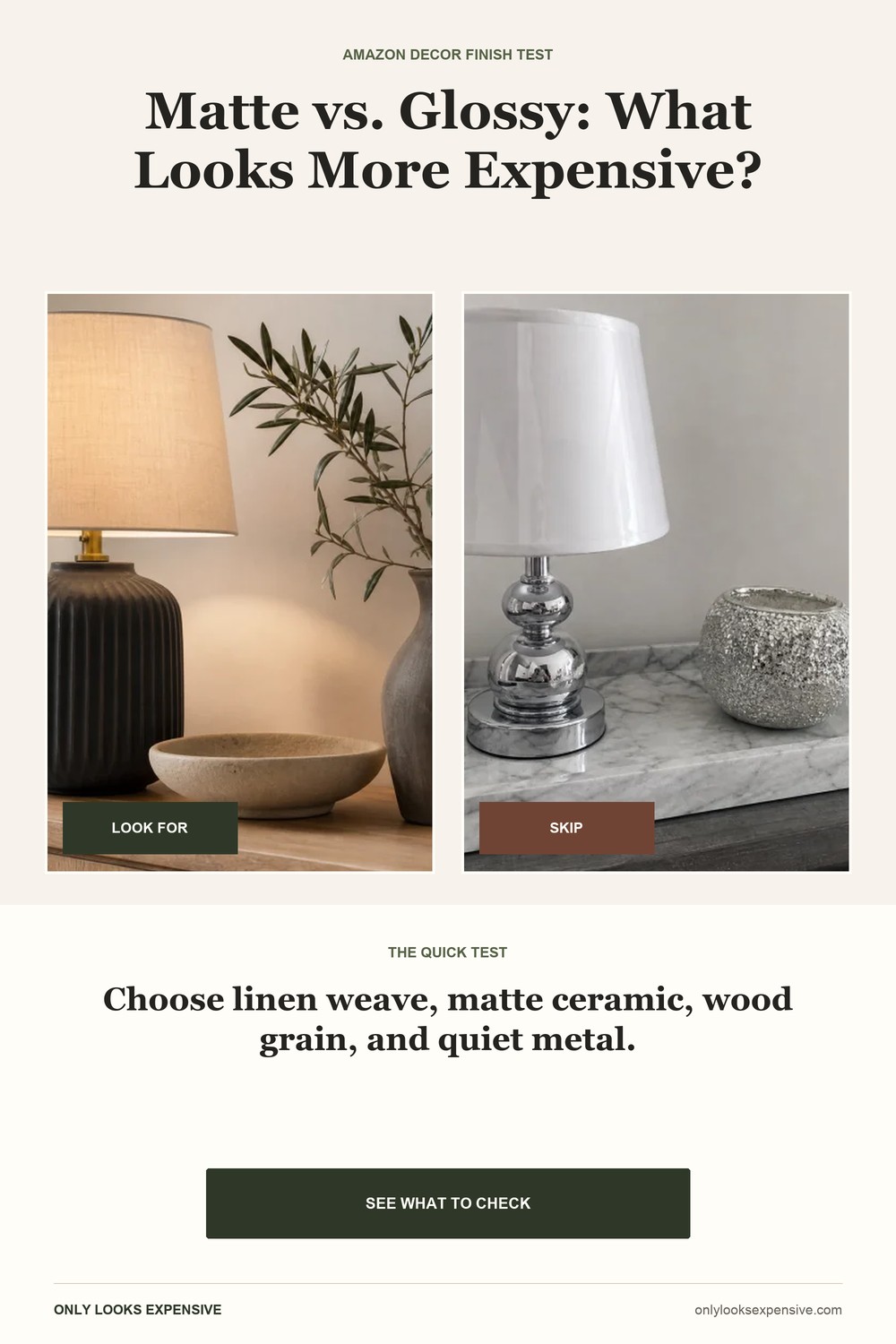
Matte texture beats imitation shine.
Matte ceramic, linen, woven fiber, wood grain, and lightly textured stone-look surfaces soften light instead of throwing harsh reflections around the room. They also mix easily with pieces you already own. Glossy plastic, glitter, and printed marble usually ask for attention before they add any function.
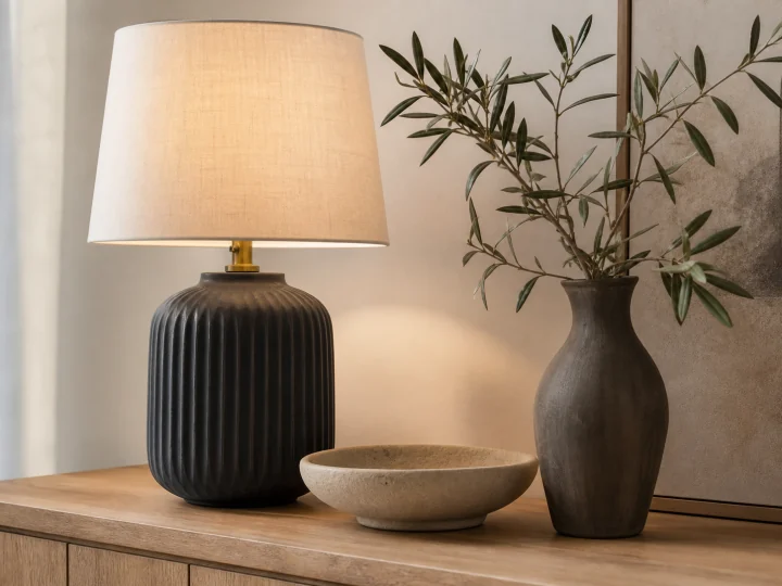 Look for
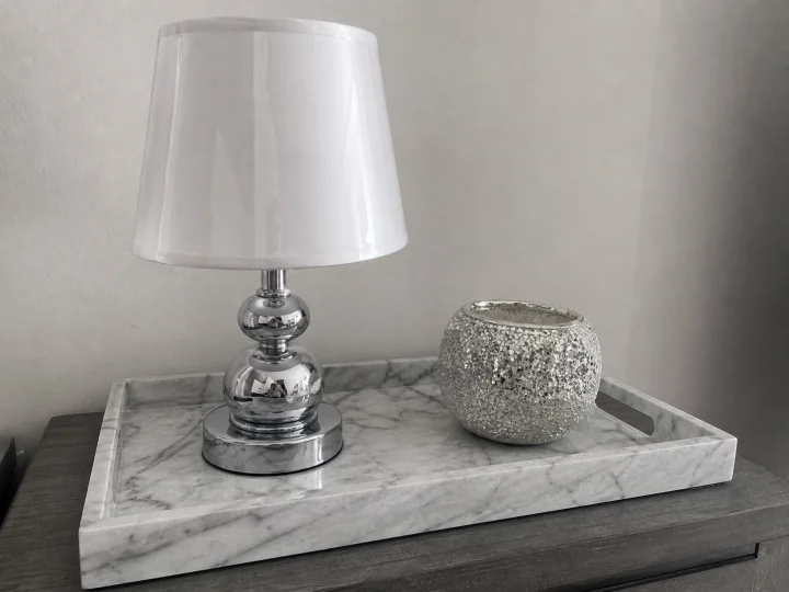 Skip
SkipOpen the close-up images. Look for a visible linen weave, an even matte glaze, and real dimensions. If every photo is heavily retouched or the material is only described as "luxury," keep scrolling.
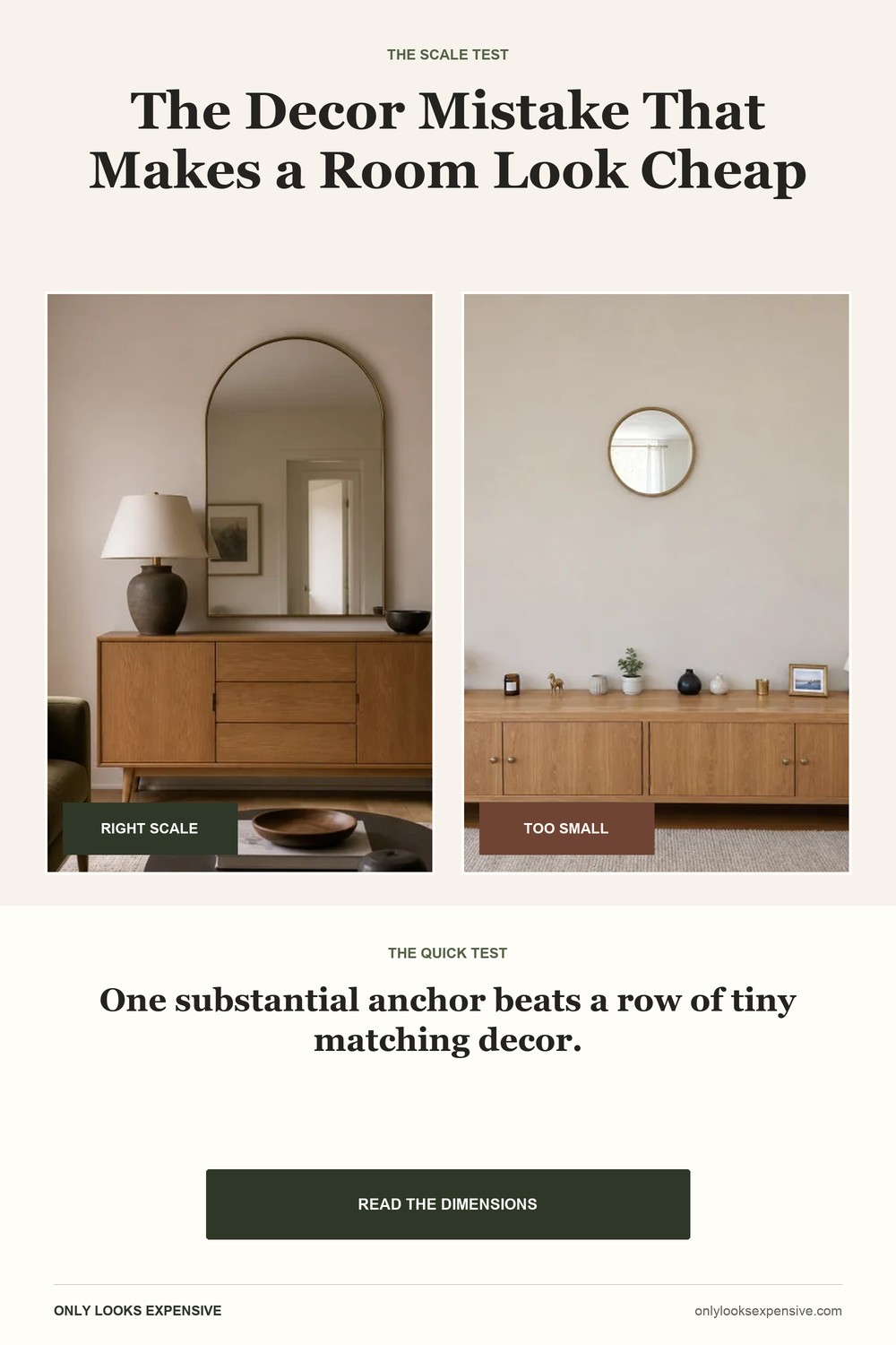
One substantial piece beats ten tiny ones.
Decor should register from the doorway. A mirror that is roughly two-thirds the width of the furniture below it creates a clear anchor. A lamp needs enough height and shade width to balance a sideboard or nightstand. Tiny matching sets often leave the wall feeling emptier while making the surface feel busier.
 Look for
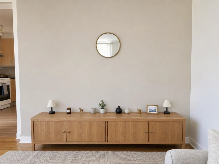 Skip
SkipIgnore the staged room for a moment and read the measurements. Mark the width on your wall with painter's tape. Customer photos can help with scale, but compare them only when the furniture dimensions are reasonably similar to yours.
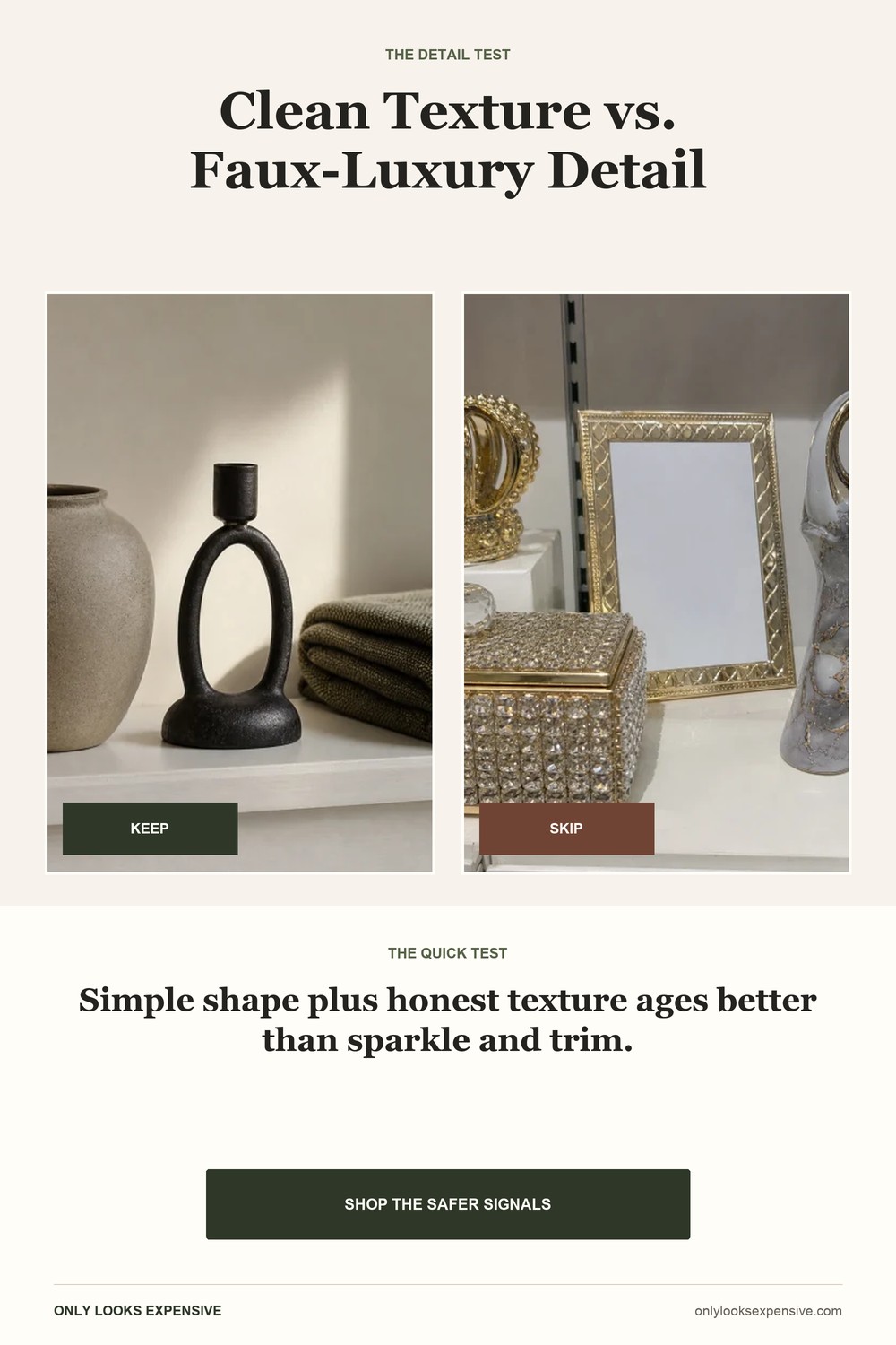
Clean silhouettes age better.
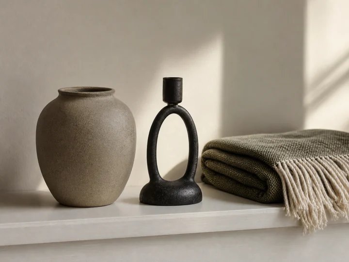
Simple does not mean boring. A rounded vessel, a curved candleholder, or a woven throw already has shape and texture. Adding rhinestones, ornate trim, slogans, and fake-gold flourishes creates several competing focal points. Those details are also harder to mix when your room changes.
 Look for
 Skip
SkipView the item as a black silhouette in the thumbnail. If the shape is clear without relying on sparkle, a slogan, or ornate trim, it is more likely to work with the rest of your room.
How we screen a product family
We start with the size required for the room, not the prettiest listing photo.
We favor visible texture, restrained finishes, and descriptions that clearly name the material.
Lighting, reflection, storage, softness, or organization earns priority over filler decor.
We flag scale ambiguity, fragile finishes, difficult installation, and details that may look different in person.
We have not physically tested every item in these searches. Confirm current materials, dimensions, prices, ratings, shipping, and returns on the retailer page before buying.
Shop by the signal you need.
These product families do visible work in a room and are easier to judge from dimensions and close-up photos than tiny decorative filler.
Selection guidance last reviewed July 11, 2026. Product availability and retailer details can change.
Keep these visual buying guides nearby.
Use the overview first, then save the finish, scale, and detail checks you want beside you while shopping.